Project Summary
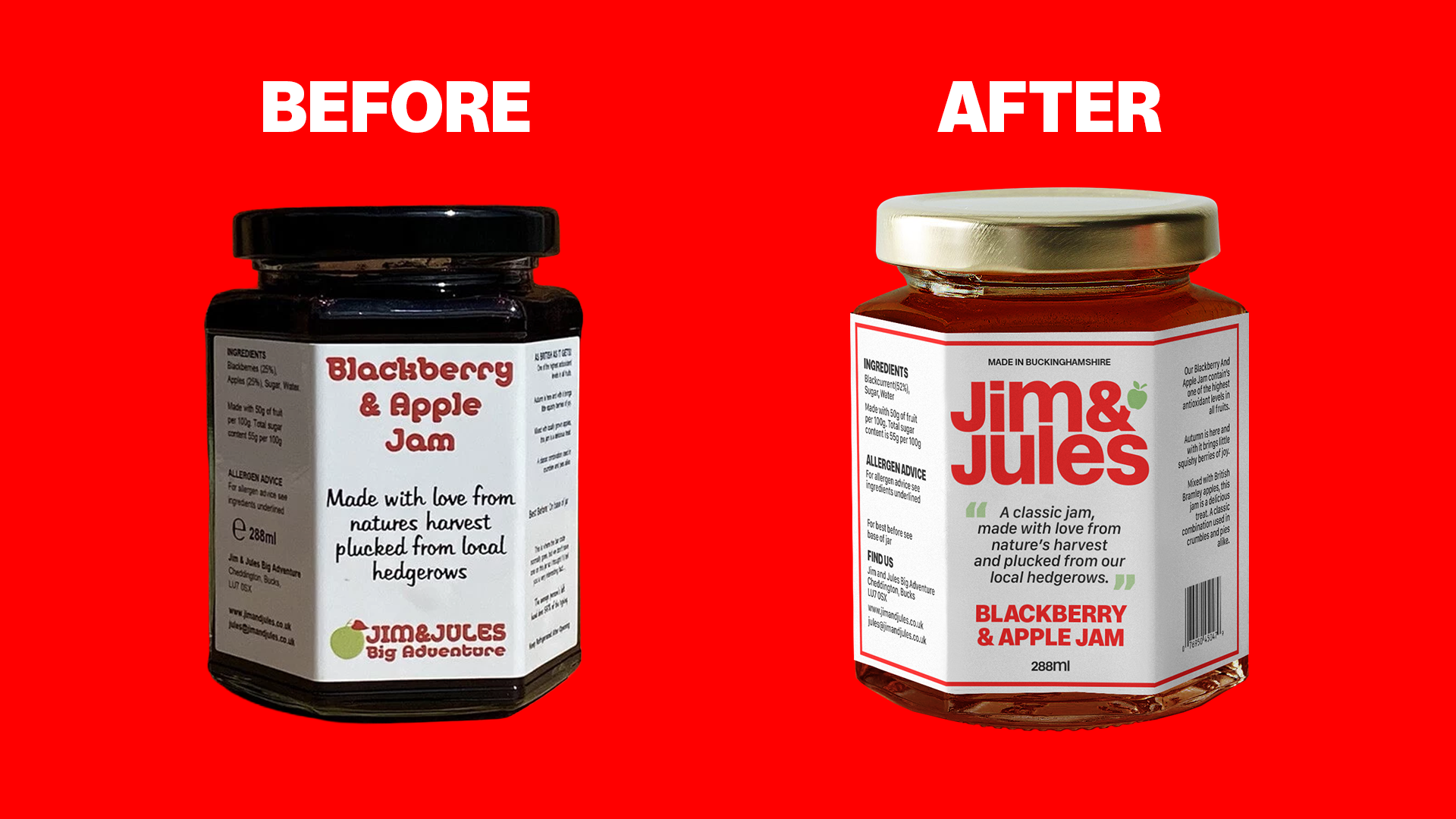
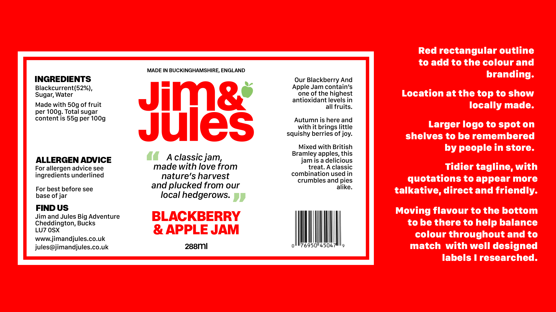
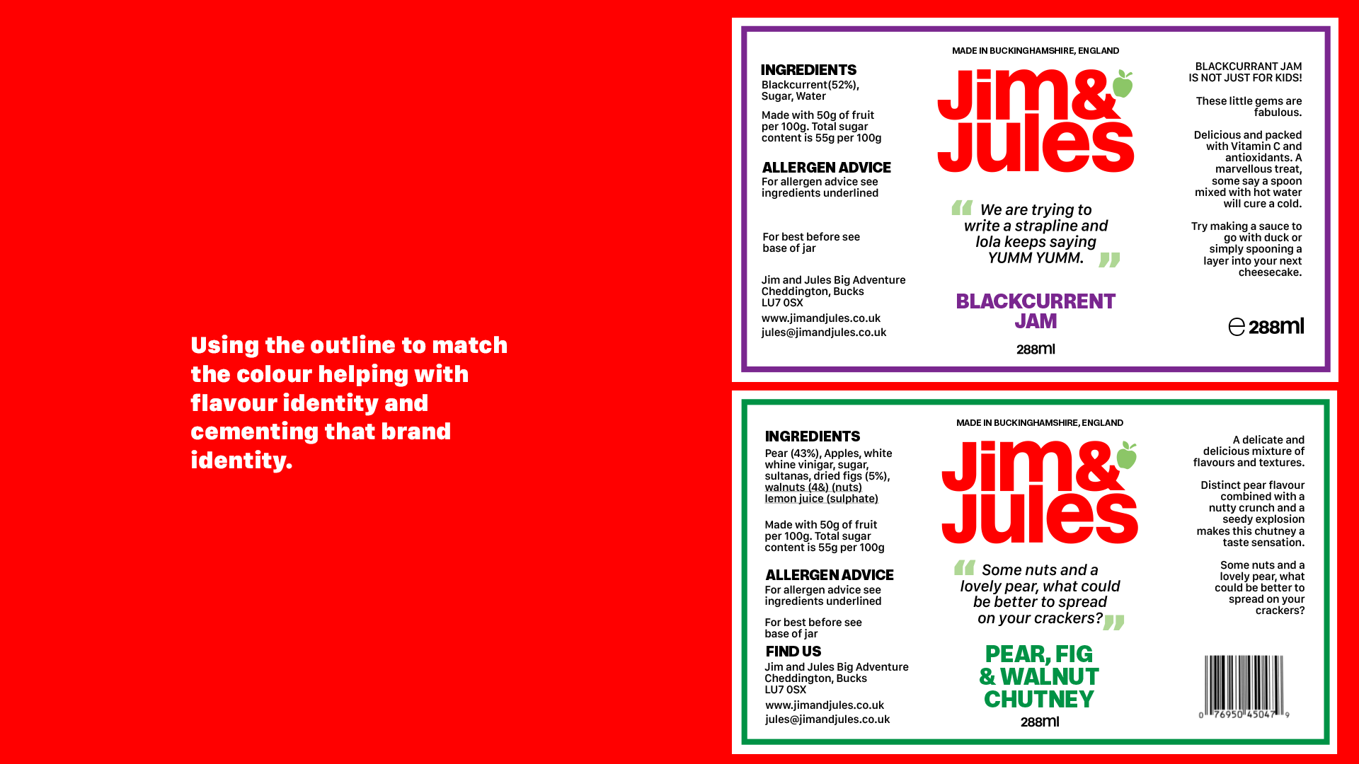
The goal here was to keep the local business look and feel with a new modern look. Keeping the integrity and structure just making some much needed tweaks to help elevate it on the shelves.
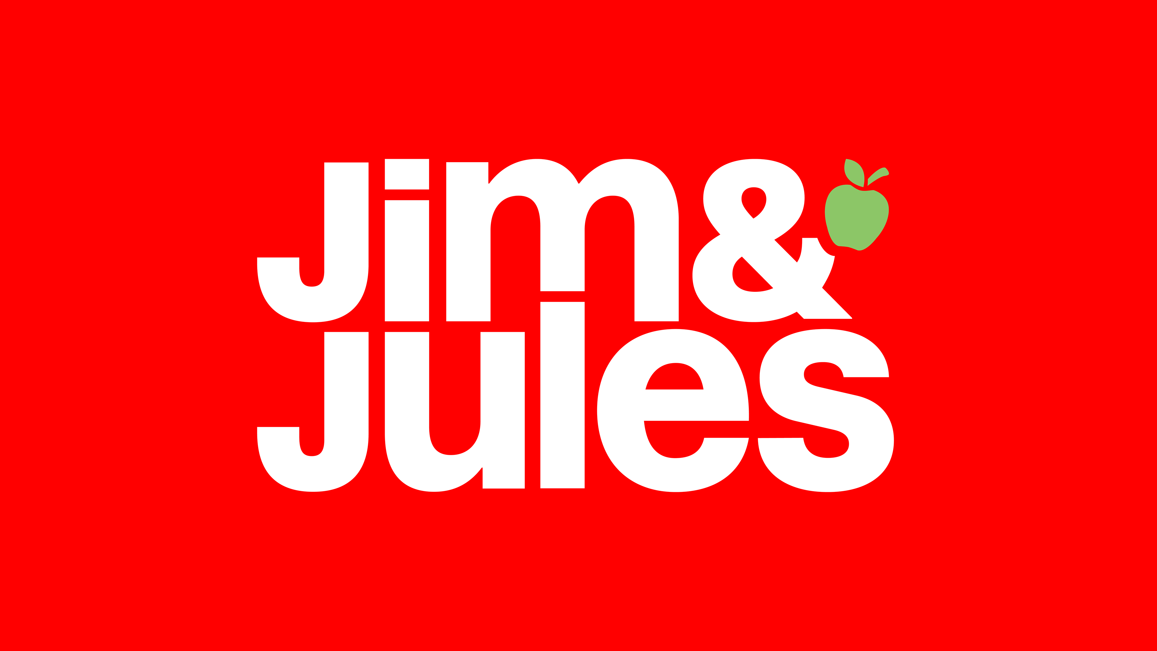
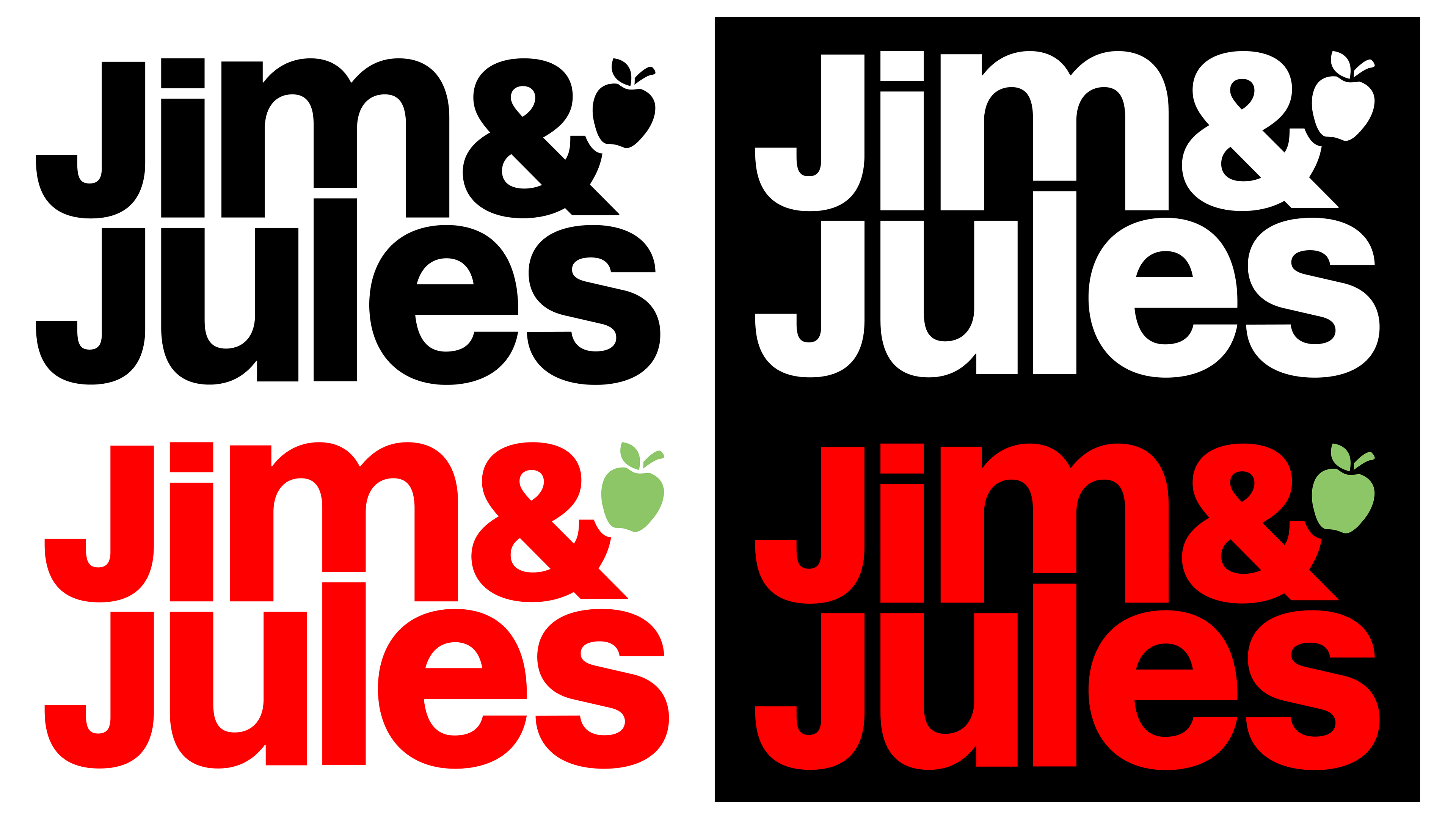
The logo rebrand was major. With a whole new look, a bold compact logo that fits well on the label and social media. The choice for lower case was to help pair with the friendly and homely style of product they sell, building that connection the business needs for customers to be drawn towards.