Project Summary
Little Tring Cakes being a local cake business for me I am familiar with their logo and their current branding. I wanted to expand my versatility and portfolio by designing branding and packaging for a cake company.
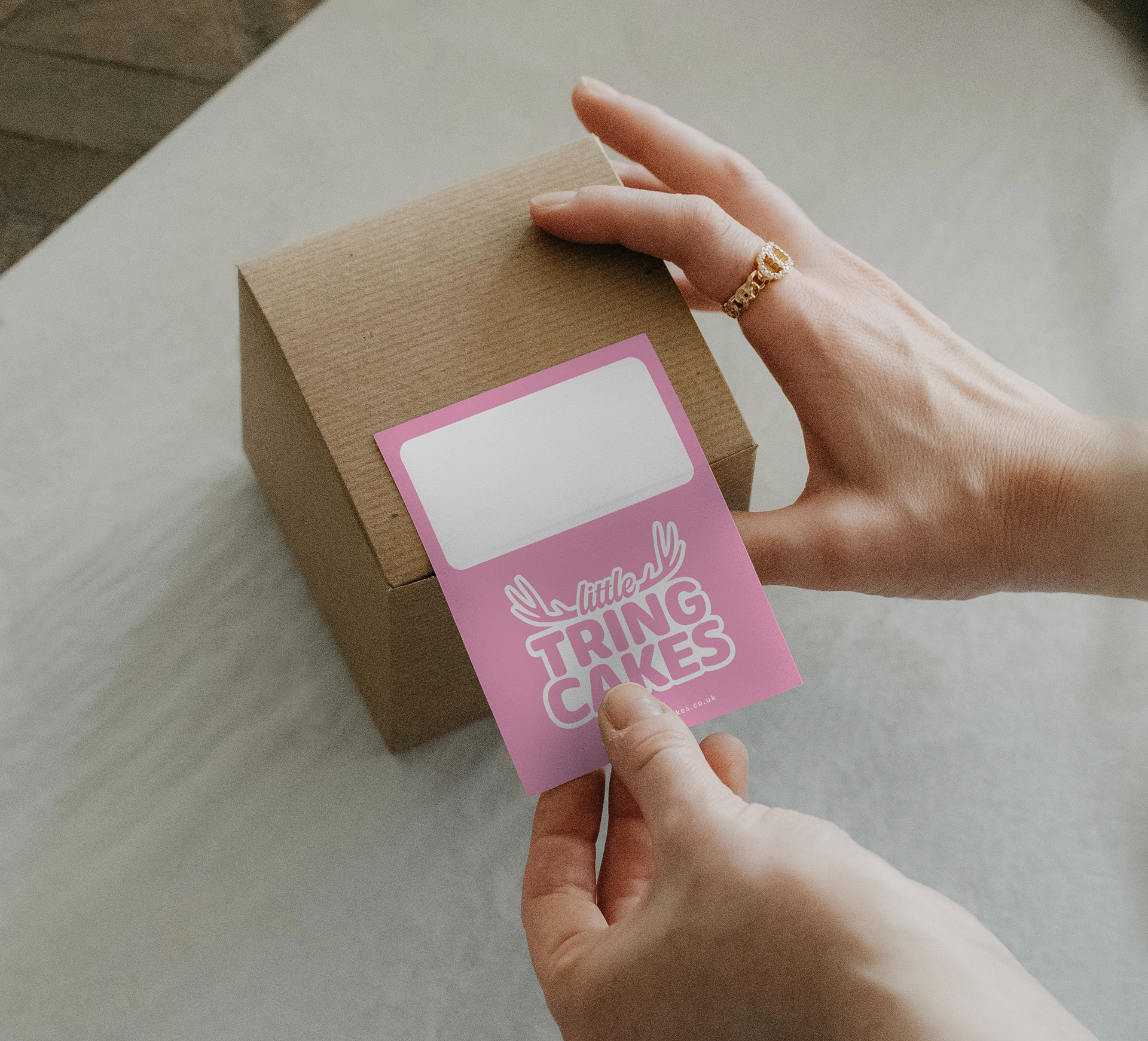
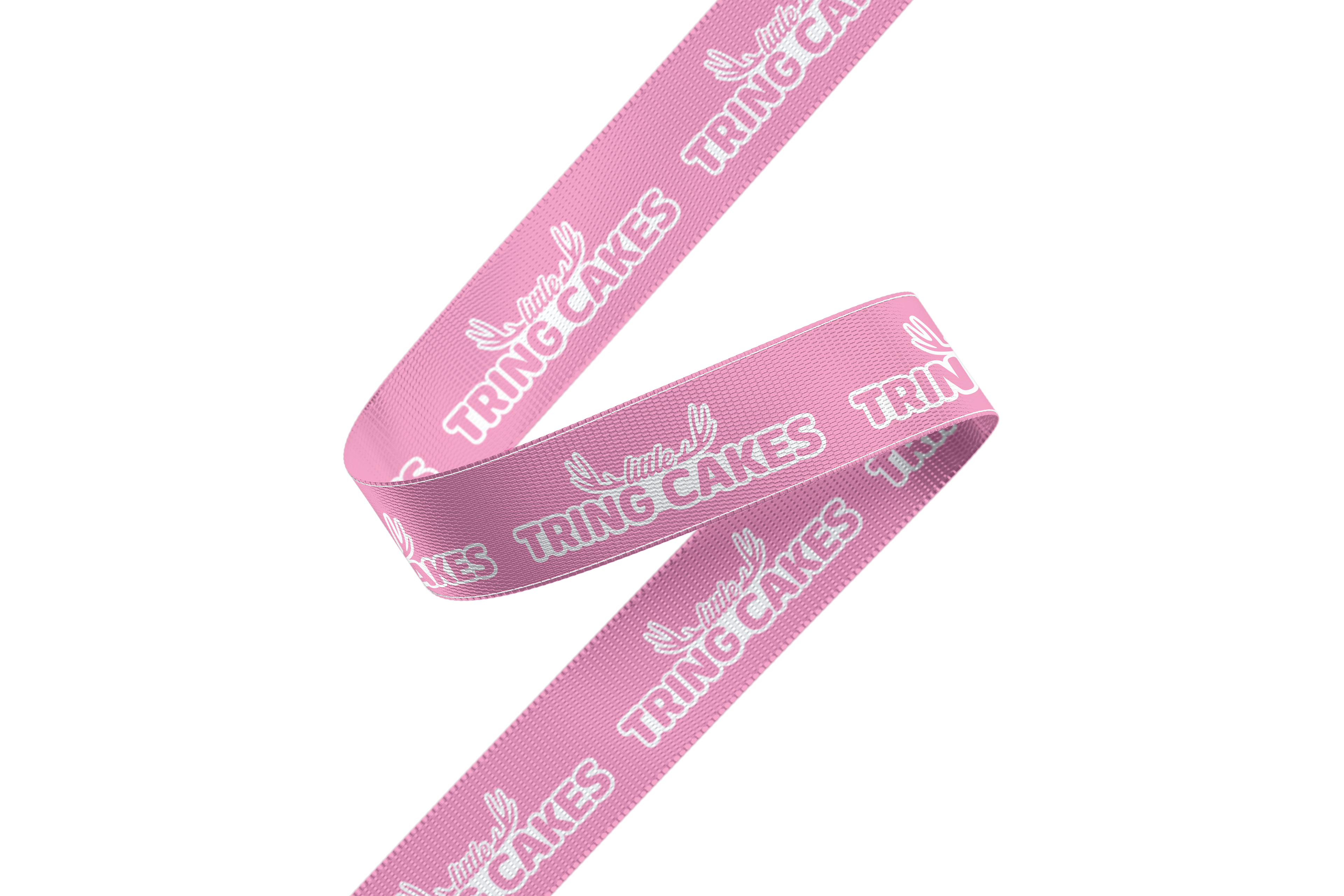
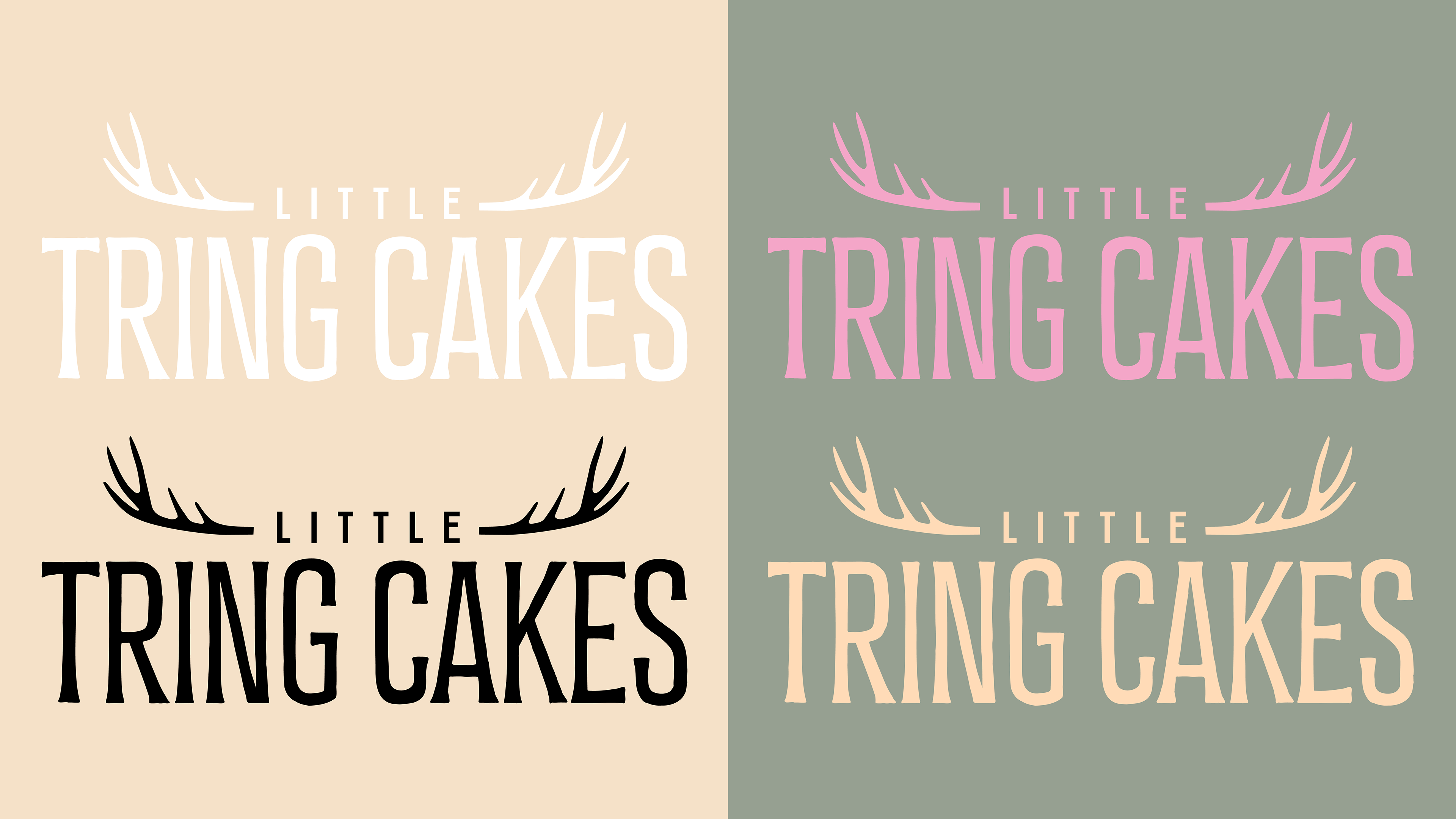
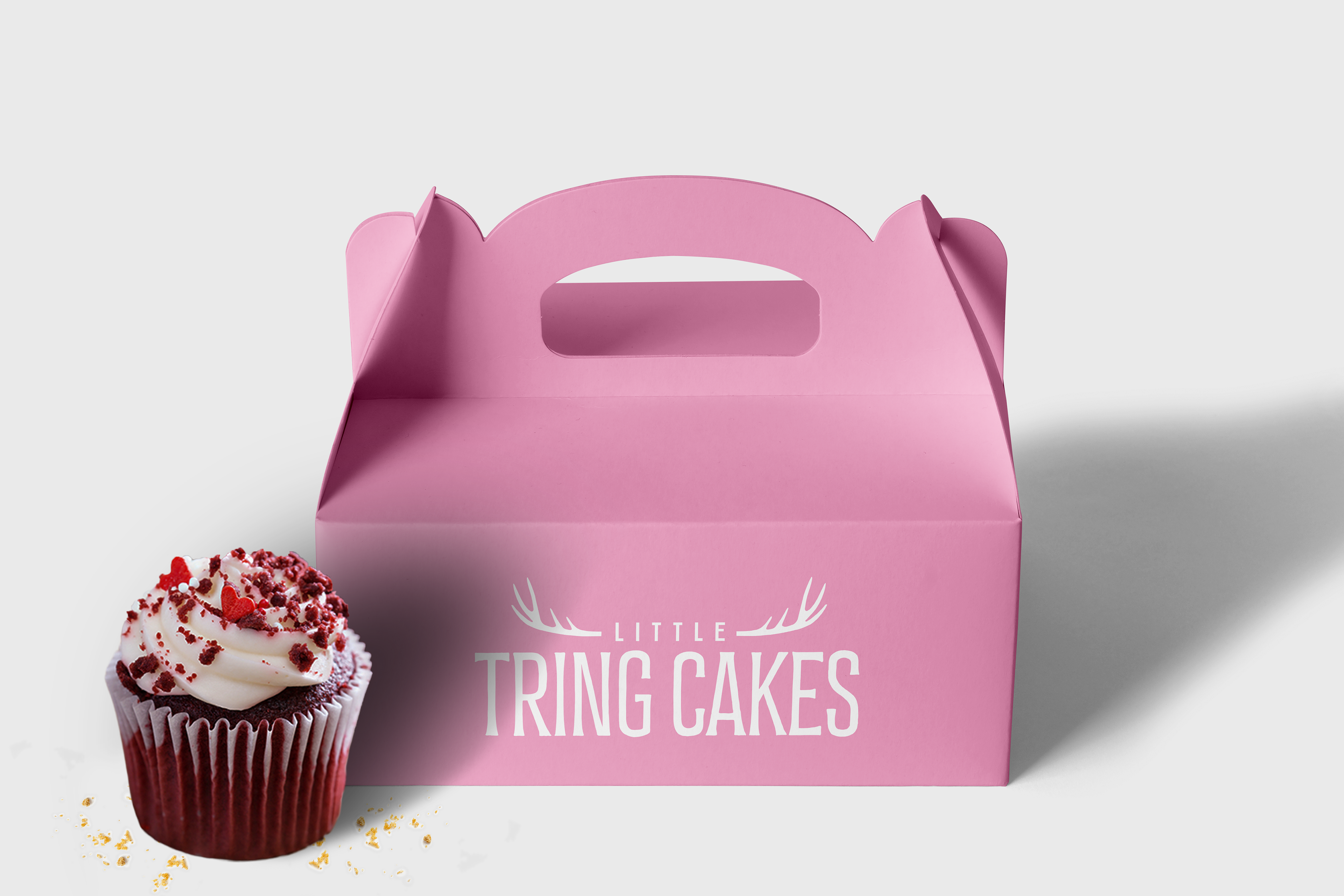
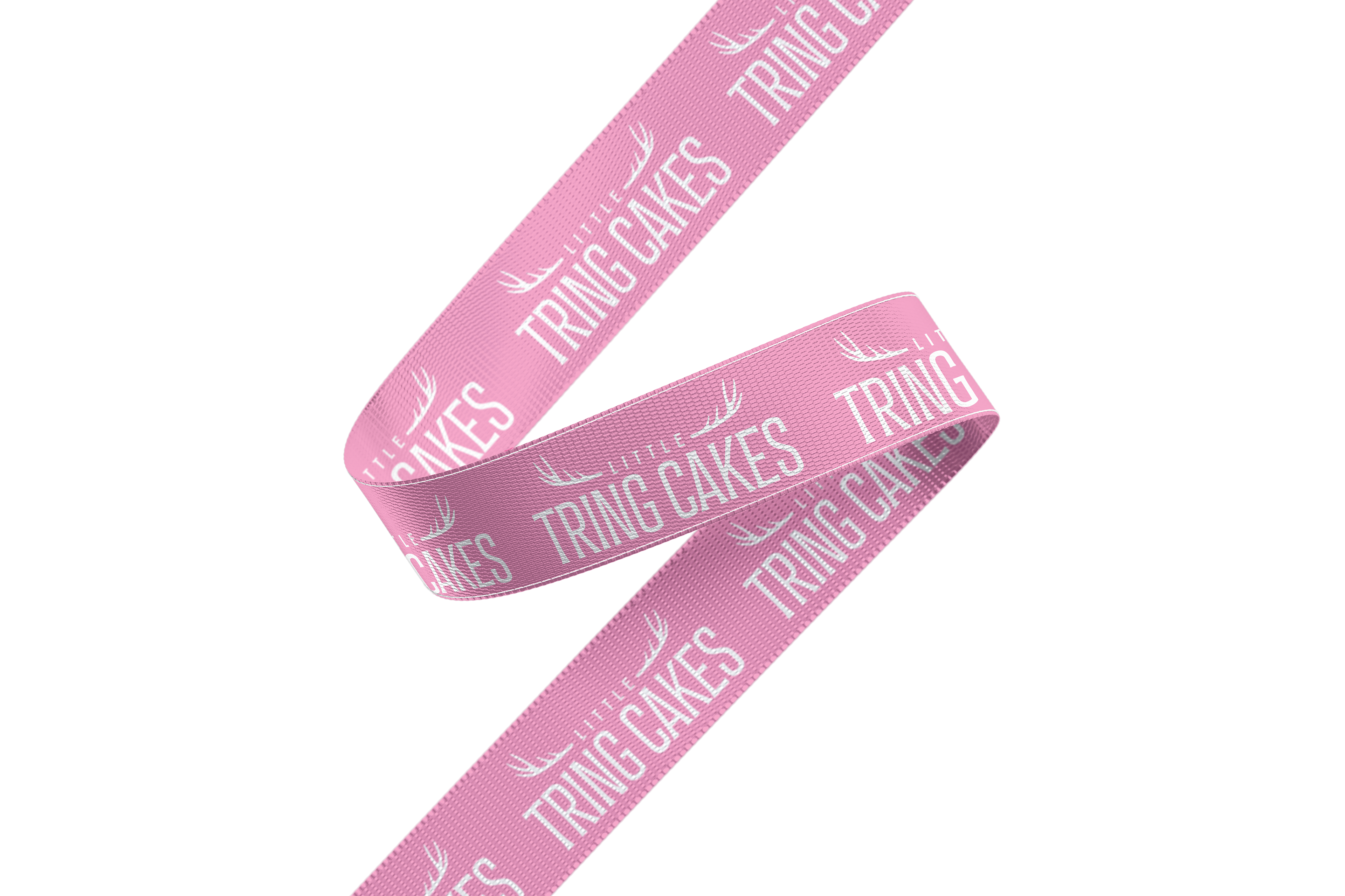
Tring having the historic Ashridge Estate and Tring Park, where deer thrive and are a local favorurite, keeping that heritage in the logo by scaling down the entire deer image to the antlers and then being able to utilise that in other branding, as seen on the paper bags. The thick borders imitating icing and the rounded type to help emphasise that.
One important change was the word 'little' needed to be little, as it allows the words TRING CAKES to be the main focus and does not de value the business.
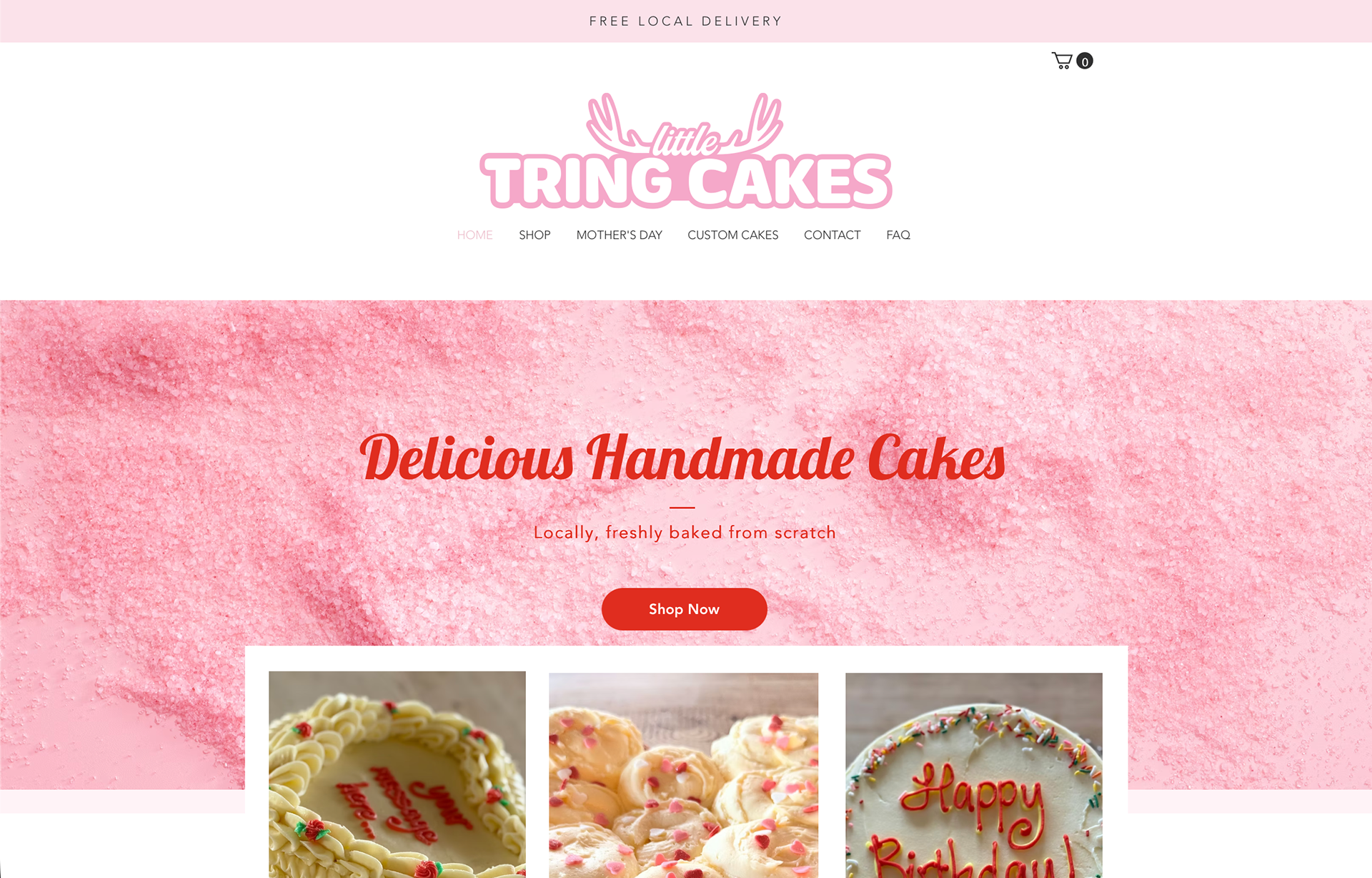
The tone of voice is targeted towards people of Hertfordshire. With a little formality to it regards to the pun 'deerly loved cakes from Hertfordshire', something a little witty yet formal.

Possible other branding for the re brand, going down the more high end route.

This is a fictional rebrand and not real experience...