Project Summary
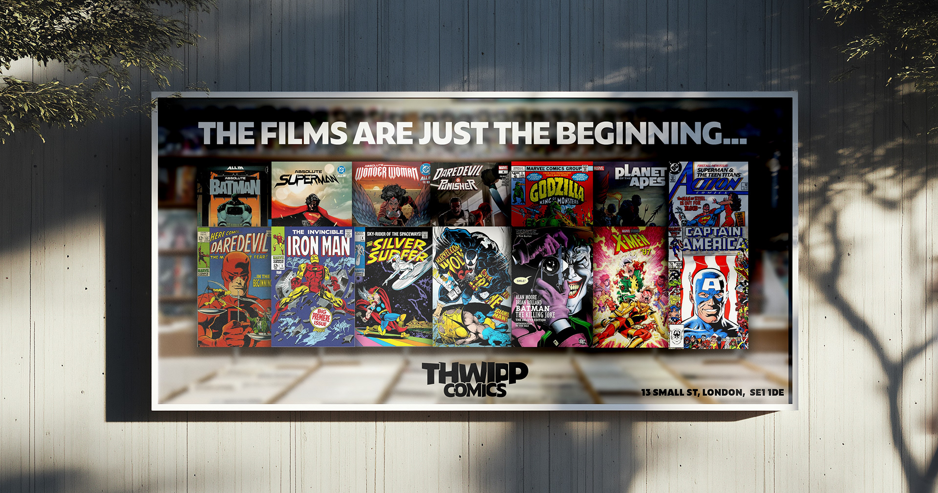
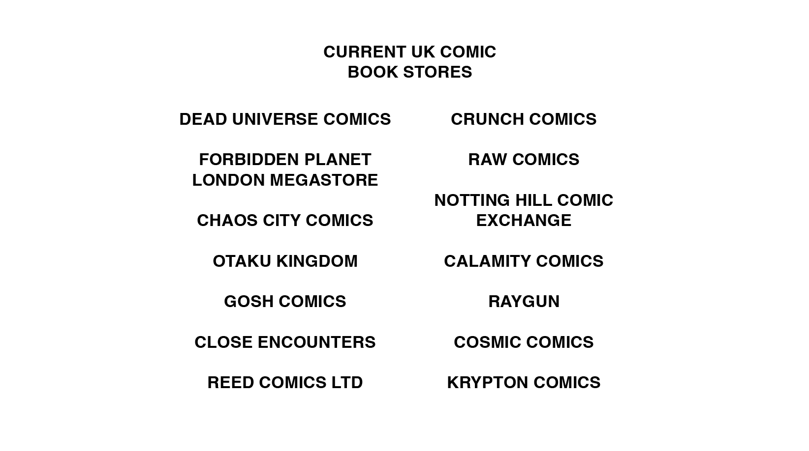
Comic book stores are notorious for having an unapproachable, dated, low budget looking visual identity. Less than 10% of superhero movie lovers actually purchase comic books, so introducing Thwipp Comics. A modern take on the classic comic book store branding that attracts more than just the comic book lovers and to help push movie fans towards the physical media route.
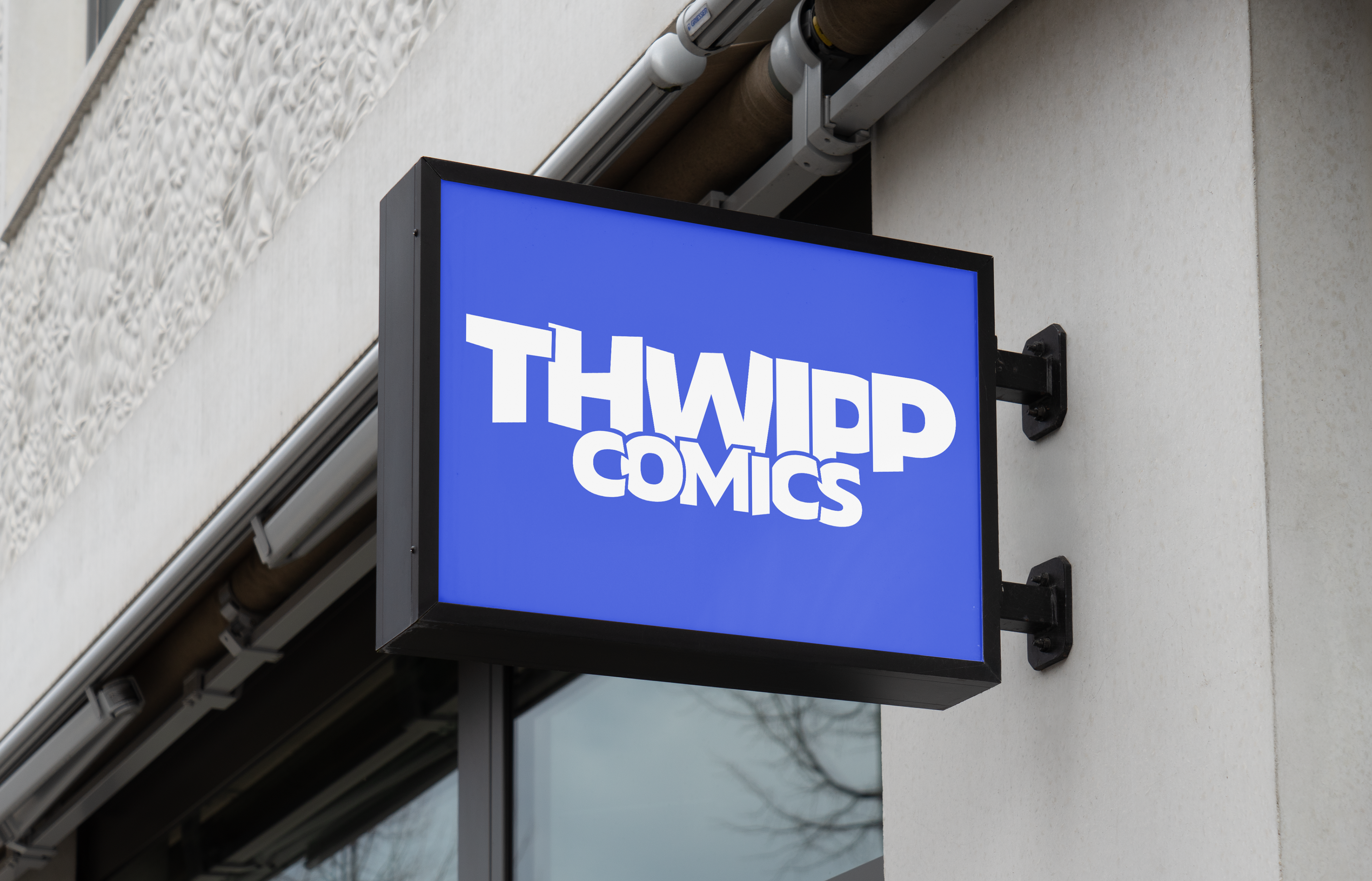
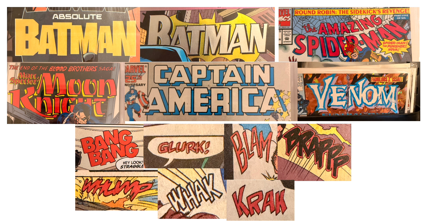
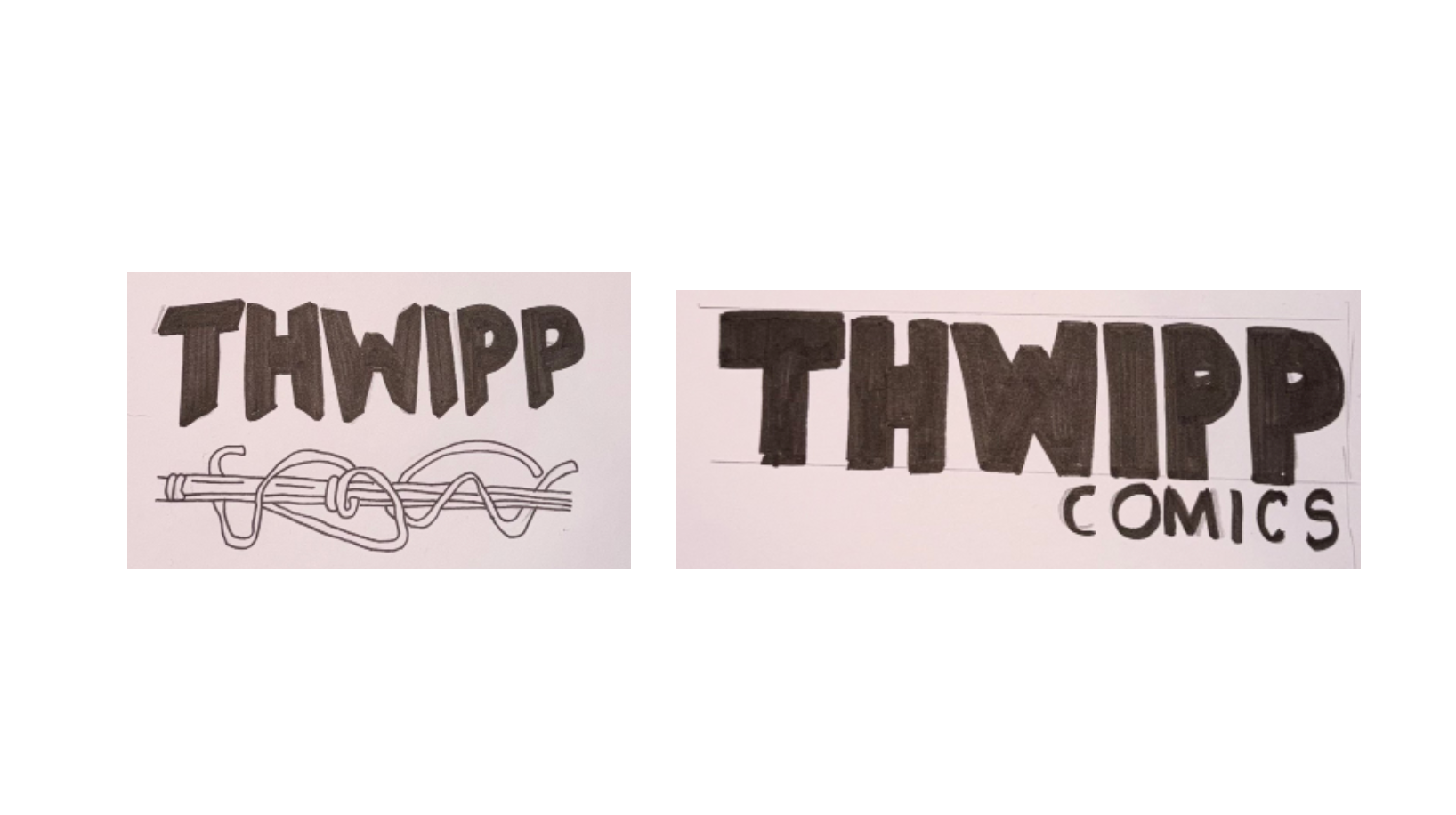
The logo design is heavily influenced by the title designs found on the front page of comics and the onomatopoeia typography designs within the comic books, however modernising it slightly to lean away from that generic comic book style, with tightly kerning it together, overlapping and creating that negative space and creating it into an approachable logo for new customers.
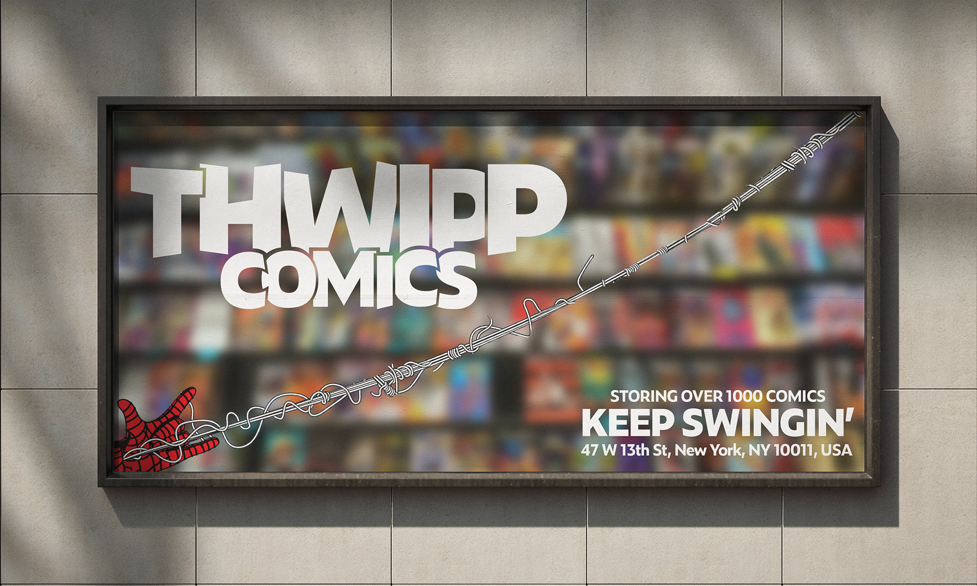
The name THWIPP, is inspired by the onomatopoeia used in Spider-Man's comics when he ejects his webs. I set out to look at all the onomatopoeia used in many different comics as it was a way to introduce uniqueness within the market, and having something quick, punchy, well-known and something with just enough geek.
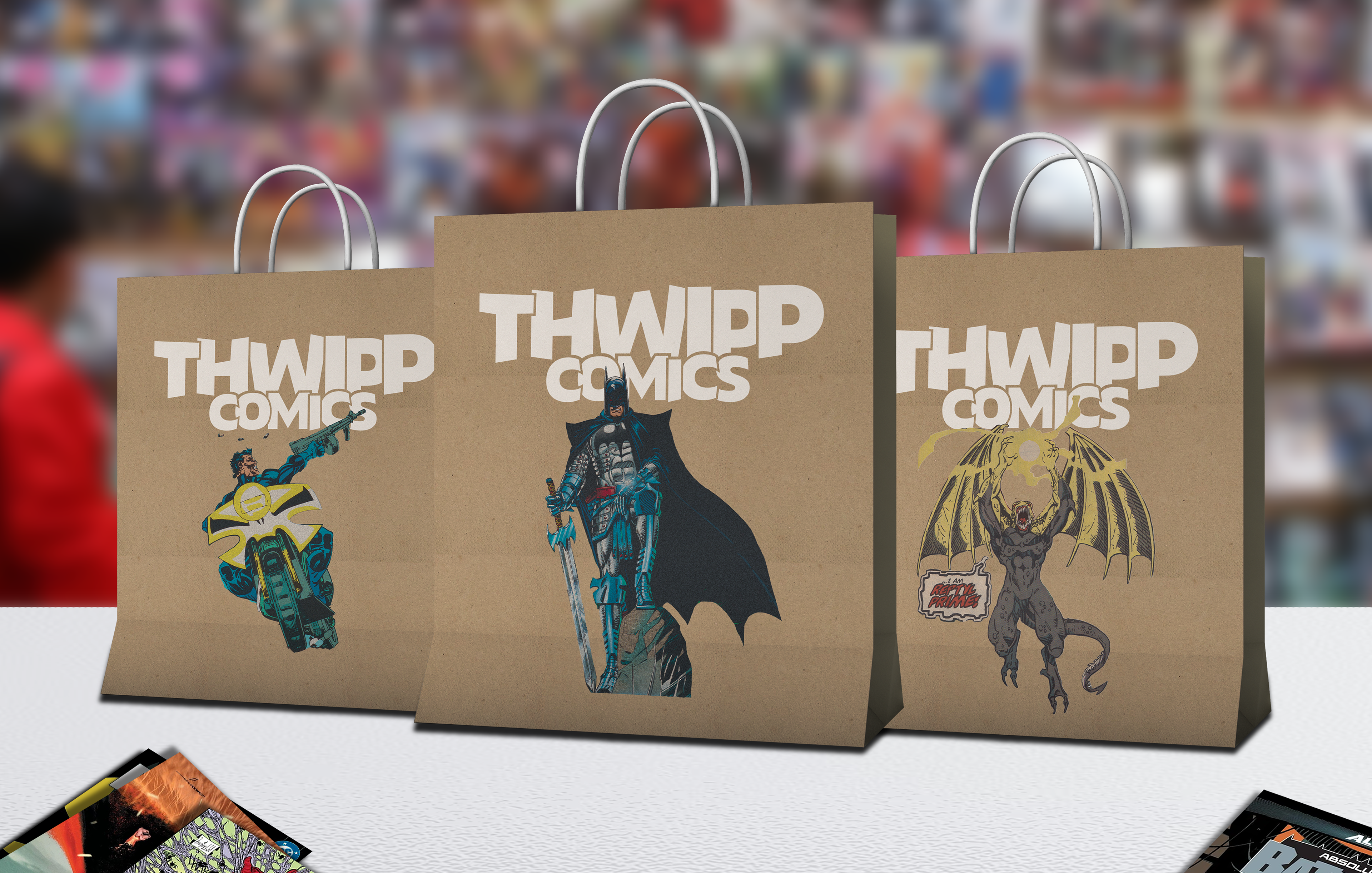
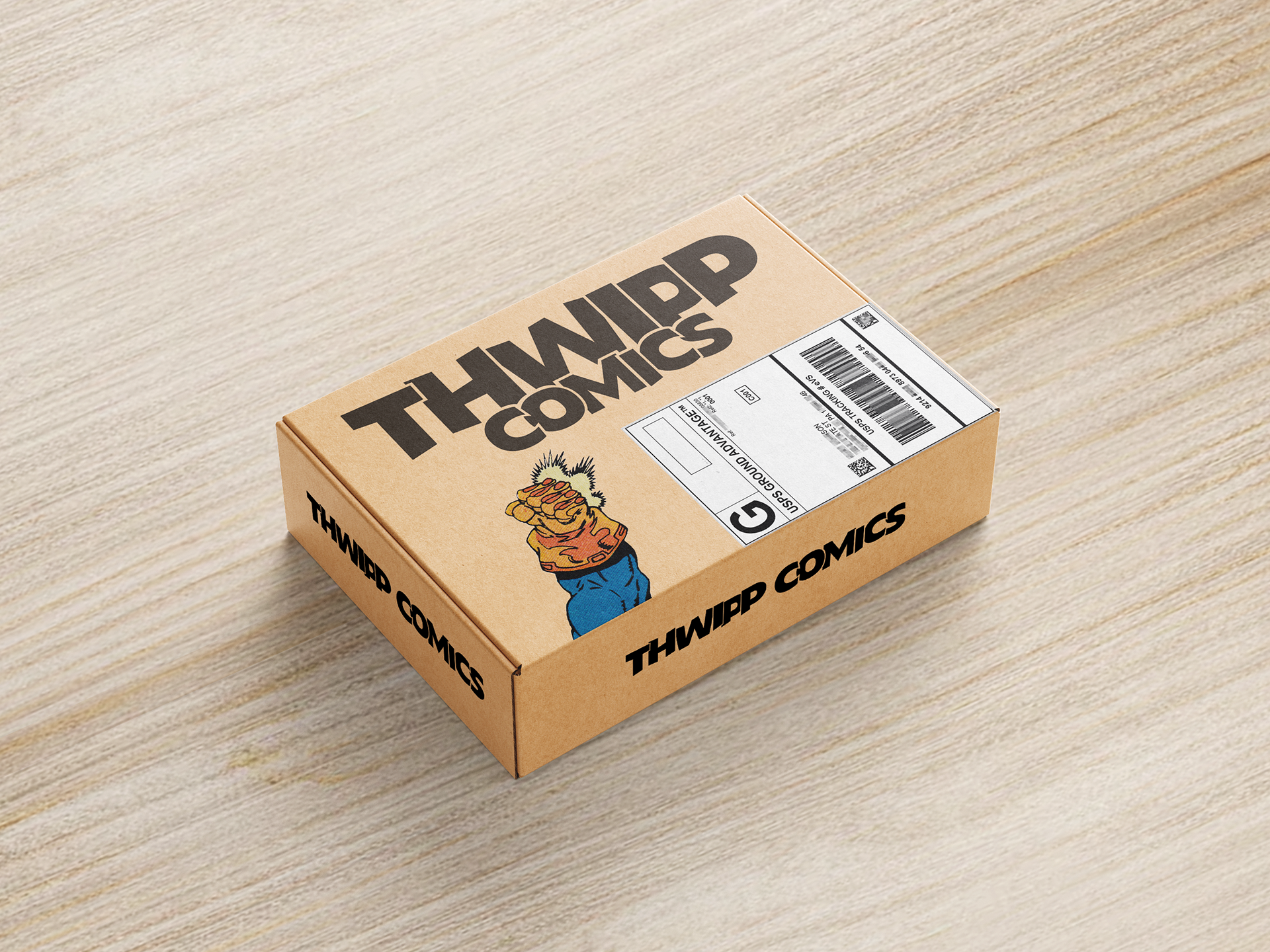
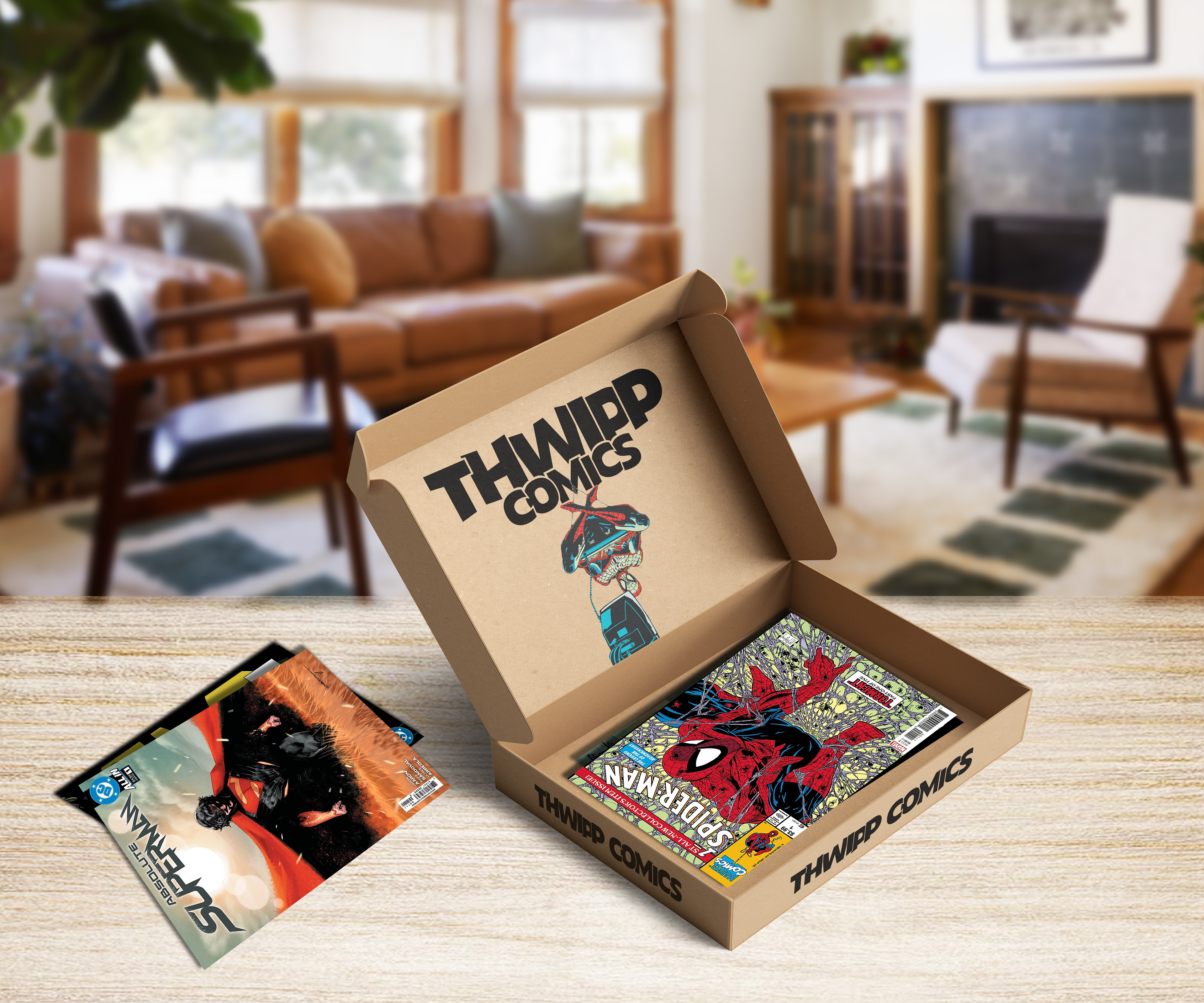
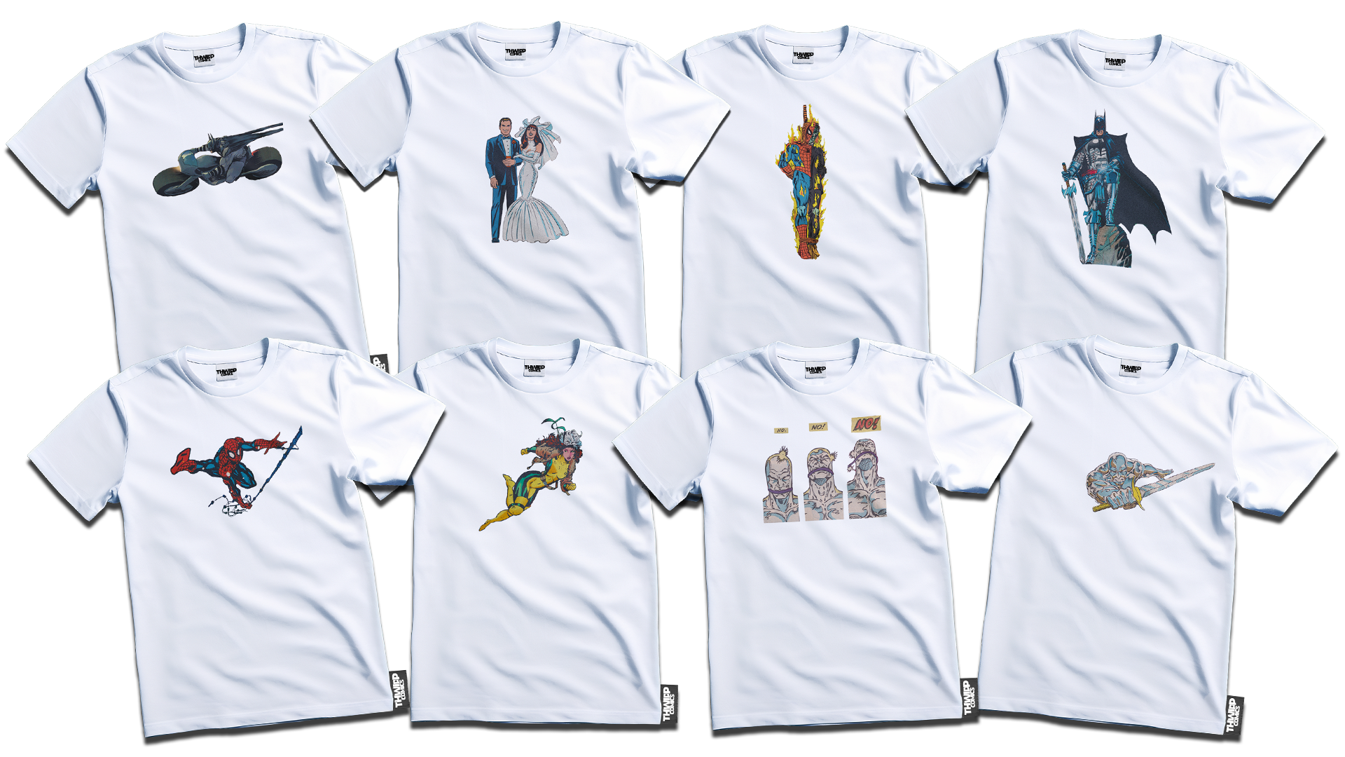
Brand awareness is something I wanted to have a leg up on to other comic book stores, due to only the really popular stores having branded bags. I went through my comic books and scanned in pages, then photoshopping the characters out of the context, using them on the packaging and bags. Pairing this with the logo in order to create a minimalistic, modern and trendy design style people will remember as a great souvenir. Especially people who will want their favorite comic book character on a bag they can reuse elsewhere.
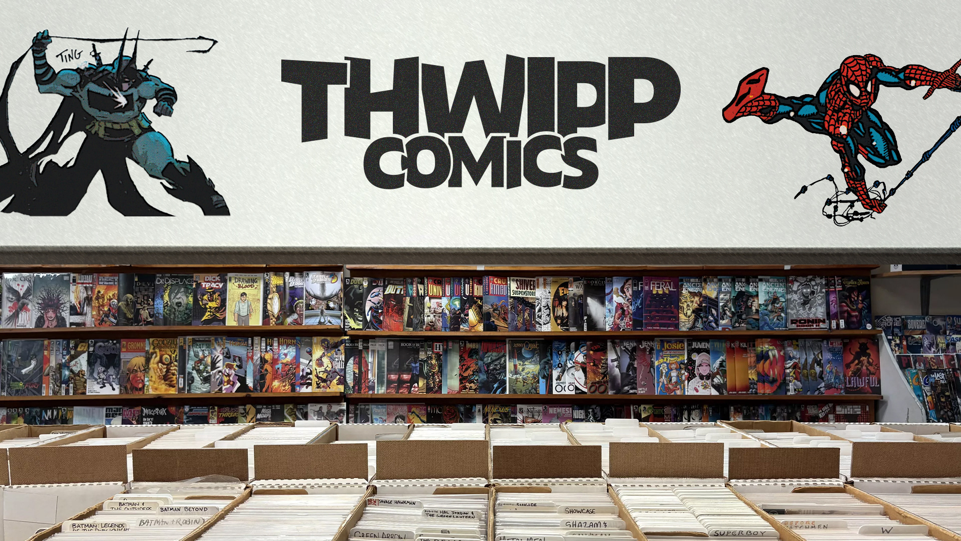
Store Interior

Research & Development Summary
Typography Inspiration Mood Board
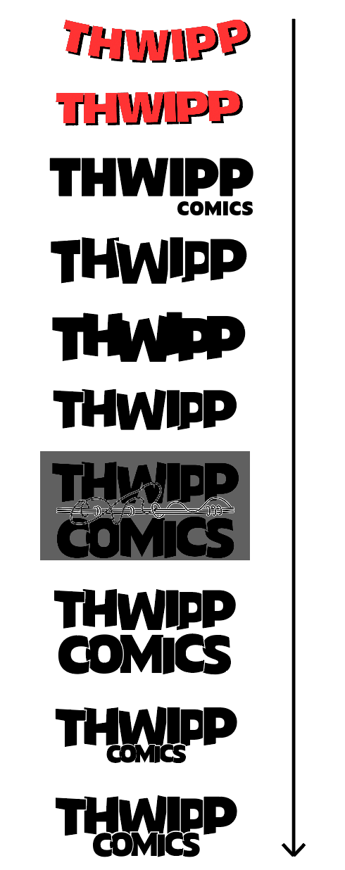
Logo Development
PROJECT STILL IN PROGRESS...