Project Summary
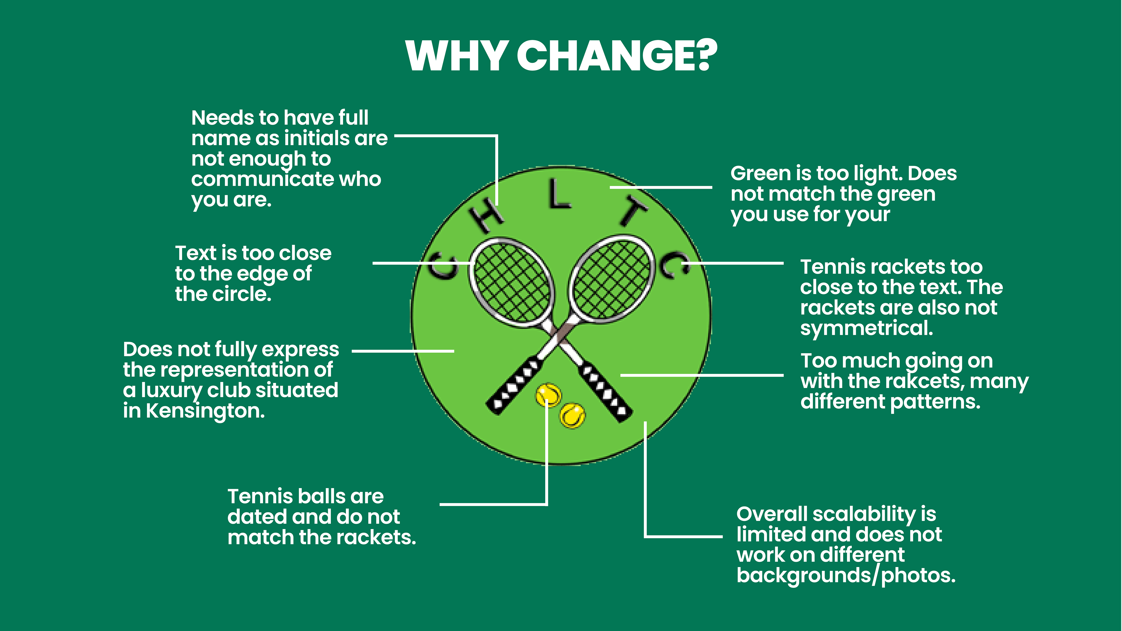
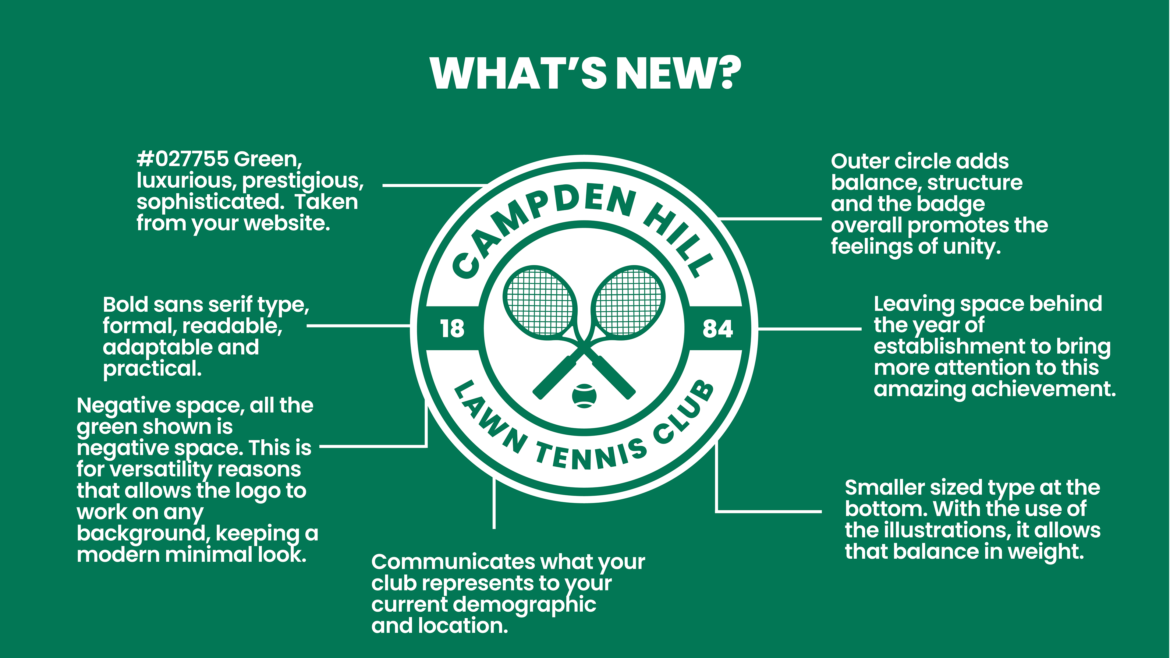
My goal was to create a modern, versatile logo that could really represent what this club is. With its location being less than 10 minute walk away from Kensington Palace, it had to represent the luxury that it is situated in.
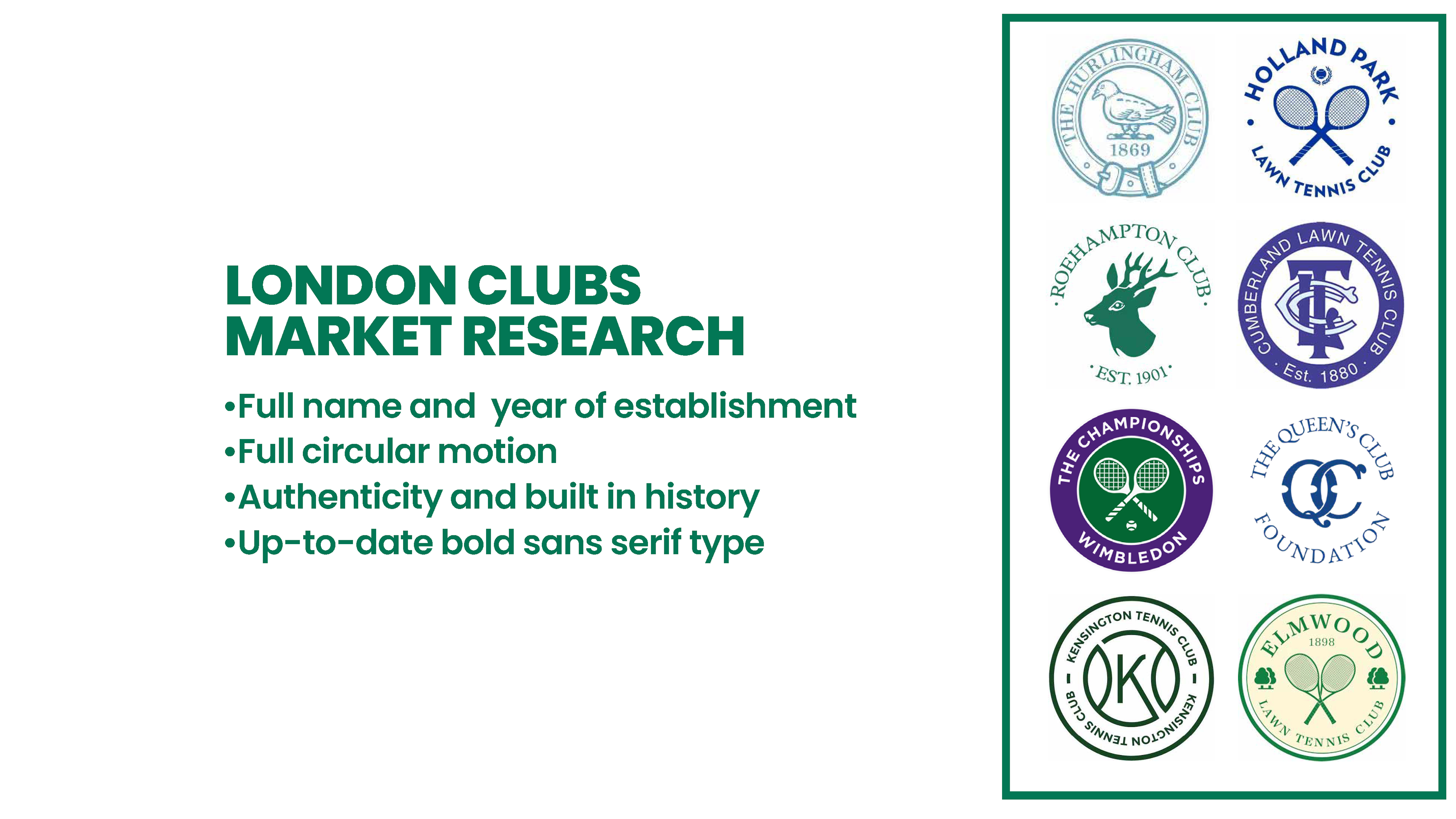
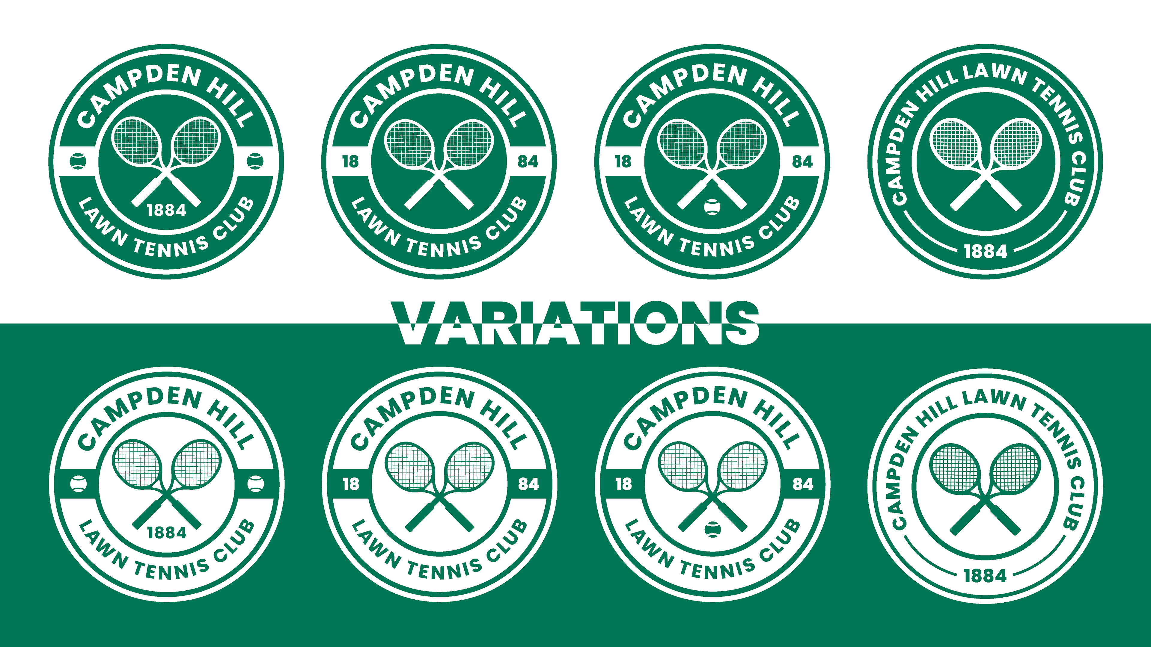
The structure of the badge is incredibly important and in researching many badge designs from all sports across the world, it allowed me to understand and be confident in the configuration of this badge.
Founded in 1884, the club had yet to include that impressive year of establishment on their badge, which is a must for a club situated in London, a city full of history.
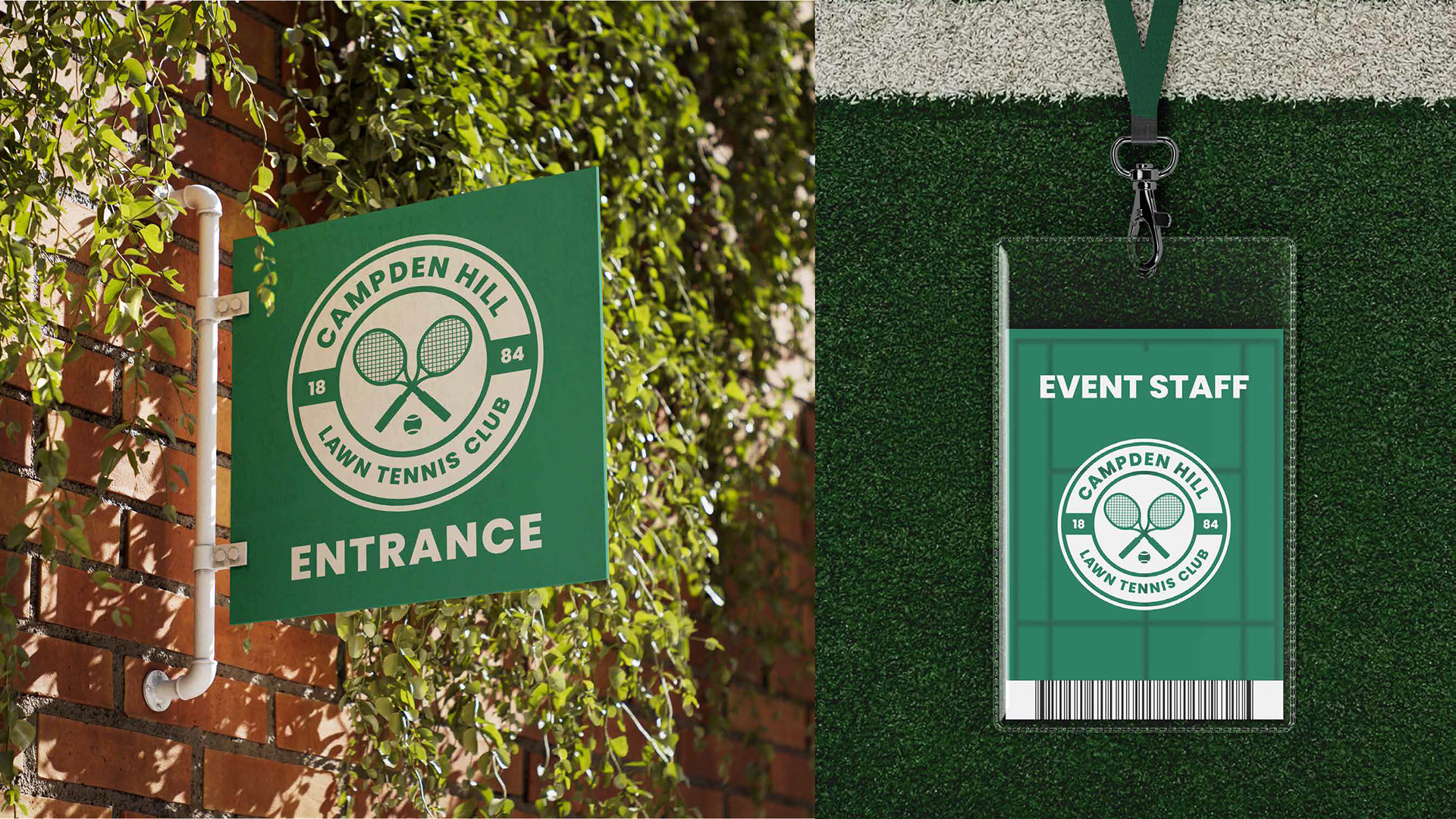
Creating the negative space look to keep boldness throughout yet introduce that versatility, minimalism and pure tidiness. The negative space is something the other clubs in London do not do, so it gives this club that bit of uniqueness that drives it against the rest.